
Posted 2014-10-01
I've been pretty happy with the redesign of this website that I did last year. It's clean but still has some character. I kept the width of the text to 540 pixels because long lines are hard to read, and the text size is a bit larger than average. Still, on the iPhone the site looks tiny:
Double tapping to zoom in on the text helps a bit, but it's still not really readable. So I decided to make an iPhone-optimized version of this site. As often in the web world, it turned out there's a bunch of tools to help with this, but it's still not an easy thing to do!
Safari on the iPhone renders websites as if they're displayed on a window that's 980 pixels wide. However, this can be adjusted by using a "viewport" setting. I use a viewport of 568 pixels. That's the width of the iPhone 5 screen in landscape. (Well, it's 1136 really but iOS quietly doubles all pixel sizes behind the scenes and 568 x 2 = 1136.)
The result is that it's no longer necessary to double tap to zoom, as Safari now renders the site as if it's displayed on a window that's 568 pixels wide. However, on devices such as iPads everything would get too big, so I also use a maximum-scale setting of 1.0. This means that if the screen is actually narrower than 568 pixels, the device will shrink the page to fit. But if the screen is wider than 568 pixels (such as 768 pixels for an iPad in portrait orientation), the page won't be zoomed.
All of the above is accomplished using the following line in the HTML of every page:
<meta name="viewport" content="width=568, maximum-scale=1.0">
But even with these settings in place, in portrait mode, the text is just too small to read. Turns out you can use "media queries" to adjust your CSS stylesheet when the page is shown on certain devices. The styles below are applied only when displaying on a screen if that screen is no more than 360 pixels wide and in portrait orientation. (The iPhone 5's screen is 320 pixels wide before doubling.)
<style type="text/css" media="only screen and (max-device-width: 360px) and (orientation: portrait)">
body { font-size: 200%; }
</style>
So on these small screens the font size gets doubled. On devices with screens between 361 and 720 pixels, such as the iPhone 6 at 375 and the 6+ at 414 pixels, the font size is 60% bigger than the standard size:
<style type="text/css" media="only screen and (min-device-width: 361px) and (max-device-width: 720px) and (orientation: portrait)">
body { font-size: 160%; }
</style>
(There are some more settings for headings and footers.)
This worked for the most part, except that the body text was actually slightly larger than the heading text. Turns out that mobile Safari automatically bumps up font sizes if it thinks those are too small. As I'm trying to control all of this myself I turned this off with the following CSS setting in the body section of the main stylesheet:
-webkit-text-size-adjust: 100%;
The result:

Nice and readable, even if I do say so myself. Turns out that the font size I used is exactly the same as the default one in the "reader" mode in Safari. And when you turn the phone sideways, in landscape you get the exact same view you get with the desktop version of Safari:
Compare the image above to that first paragraph:
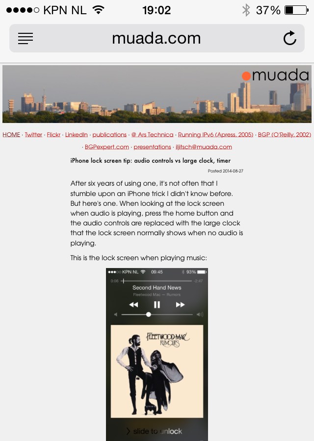
After six years of using one, it's not often that I stumble upon an iPhone trick I didn't know before. But here's one. When looking at the lock screen when audio is playing, press the home button and the audio controls are replaced with the large clock that the lock screen normally shows when no audio is playing.
Looking good or not so good on your system? Send me a screenshot!